A financial dashboard, in theory, is one of the most useful tools a finance team has. Real-time visibility over revenue, profit, cash and key ratios — all in one place, updated automatically. In practice, most dashboards are either ignored after the first week or misread in ways that lead to the wrong conversations.
The problem is rarely the technology. It is the habits around it — what questions people bring to a dashboard, how they interpret what they see, and what they do next. This guide covers how finance professionals should approach their dashboards, and the most common mistakes worth avoiding.
What a Dashboard Is Actually For
A financial dashboard is a signal detector, not a reporting system. Its job is to show you where something has changed enough to warrant attention — not to explain why it changed, or to replace the analysis that follows.
The distinction matters. Finance teams that use dashboards as reporting tools end up in board meetings presenting screenshots of KPI tiles. Finance teams that use them as signal detectors arrive at the same meetings knowing which numbers moved, having already investigated the cause, with the narrative ready.
Dashboards answer the question: is anything here worth looking into today? The report, the drill-down and the conversation that follows are how you answer: why, and what should we do about it?
The Dos: How to Use a Dashboard Well
Open it with a question, not a browse
The most effective dashboard habit is arriving with a specific question before you open it. “Is revenue on track this month?” is a better prompt than opening the dashboard and scanning for anything interesting. When you know what you are looking for, you read the data more accurately and waste less time on numbers that are moving within normal range.
Always compare, never just read
A revenue figure of $143,800 means nothing in isolation. The same figure compared to last month (+30.5%), last year (+43%), and budget (+2%) tells you something. Good dashboards surface comparisons by default — prior period, year-to-date, year-on-year. Finance teams that form the habit of reading every number against a benchmark catch variances that would otherwise disappear into a row of green ticks.
Look at trends, not just the current period
A single strong month can mask a deteriorating trend. A single weak month can hide a recovery in progress. The trend line — whether it is a six-month revenue chart or a rolling Net Profit Margin — tells the story the current-period KPI cannot. Build the habit of checking the trend for any metric that matters to a decision you need to make.
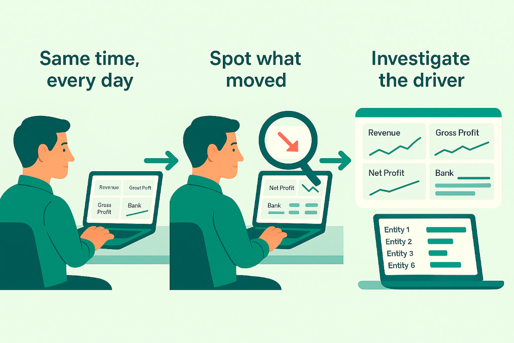
Drill down when something moves
For multi-entity groups, any group-level movement needs to be traced to the entity driving it before it is worth discussing. Group revenue up 30%? That could mean all entities are growing steadily, or it could mean one entity had an exceptional month that will not repeat. Only entity-level drill-down tells you which it is — and the two require completely different conversations with the board.
Use it consistently, at the same cadence
Dashboards build their value through comparison over time. A team that reviews the same dashboard at the same point each month builds a reliable sense of what “normal” looks like for their group. That baseline is what makes an abnormal reading obvious. Irregular or infrequent dashboard reviews mean you are always looking at unfamiliar numbers, which makes it harder to spot what matters.
The Don’ts: Mistakes That Undermine Dashboard Value
✓ Do
- Limit KPIs to the metrics that directly inform a decision
- Always read numbers against a comparison period or benchmark
- Drill into entity-level detail when a group number moves unexpectedly
- Use trends to separate one-off spikes from structural changes
- Review on a fixed schedule so you build a baseline for “normal”
- Treat the dashboard as the start of the conversation, not the end
✗ Don’t
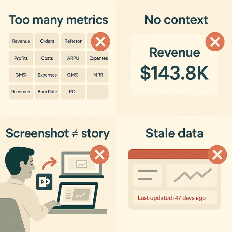
- Add every available metric — more KPIs dilutes attention, not increases it
- Present a dashboard screenshot to the board without narrative
- Accept a green KPI at face value — check whether the benchmark is meaningful
- Use dashboards as a substitute for the underlying report
- Let data go stale — a dashboard pulling from last month’s figures gives false confidence
- Skip the entity drill-down and explain a group movement without knowing the source
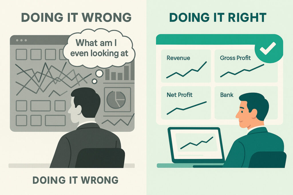
The KPI Overload Problem
One of the most common dashboard failures in finance teams is trying to monitor everything at once. A dashboard with sixteen KPI tiles, five charts and three tables is not more informative — it is less. Cognitive load means that the more there is to look at, the less any individual metric gets the attention it deserves.
The discipline of choosing five to seven KPIs that directly reflect your group’s current priorities is harder than it looks. But a CFO who looks at Revenue, Gross Profit Margin, Net Profit, Cash and Receivables Days every morning has a clearer picture than one who glances at twenty metrics and retains none of them.
A useful test: if a metric does not change a decision or trigger an action when it moves outside of a normal range, it probably does not belong on the main dashboard. Put it on a secondary view for when someone needs to investigate rather than keeping it on the front page of every morning check-in.
Dashboards and Board Reporting
A dashboard is not a board pack. This seems obvious, but plenty of board meetings contain projected screenshots of dashboards with no commentary. The problem is that numbers without narrative leave the board to draw their own conclusions — which may not be the ones the finance team intended.
The right role of a dashboard in board reporting is as the source from which the narrative is built. A CFO who has been reviewing the Profitability Dashboard consistently throughout the month arrives at a board meeting knowing that Gross Profit Margin compressed this quarter, that Cost of Sales rose faster than revenue, and that the driver was one entity’s increase in supplier costs. The dashboard surfaced the signal. The investigation produced the explanation. The board hears the story — not the screenshot.
The one-minute test: Before any board presentation, cover the numbers on your dashboard and ask yourself: can I explain what happened and why from memory? If yes, you have used the dashboard correctly. If not, you have been looking at numbers without analysing them.
What Good Dashboard Design Enables
The habits above are much easier to build when the dashboard itself is well-designed. Specifically: when it shows comparisons automatically, when it connects headline KPIs to the underlying accounts that drive them, and when switching from group view to entity view is a single click rather than a separate report run.
BrizoConsol’s default dashboards are built around these principles. The four dashboards — Main, Profitability, Asset and Debt Management — each show headline KPIs with prior-period comparisons alongside the trend line, so the context is always present without needing to be set up manually. The Profitability Dashboard includes a Margin Analysis table and Key Ratios panel that surface the analytical layer automatically. The AI-generated Executive Summary on the Profitability Dashboard produces a plain-language narrative of the period’s results — a starting point for the commentary that most teams build manually.
Critically, every dashboard supports entity-level drill-down via the organisation selector in the top-left corner. When a group KPI moves, switching to the relevant entity view takes one click — which removes the most common reason finance teams skip the drill-down: it used to require pulling a separate report.
For groups running multi-entity month-end close, real-time dashboards that update automatically from each entity’s connected accounting system — Xero, QuickBooks, MYOB or Zoho Books — mean the data is current without a manual consolidation run. The signal arrives as soon as the underlying books are updated.
Want to see what your group looks like on a well-designed dashboard? BrizoConsol’s four default dashboards are live from day one — no setup required. Connect your entities and the consolidated view is ready immediately.