Why Nobody Looks at Your Group Dashboard (And How to Build One They Will)
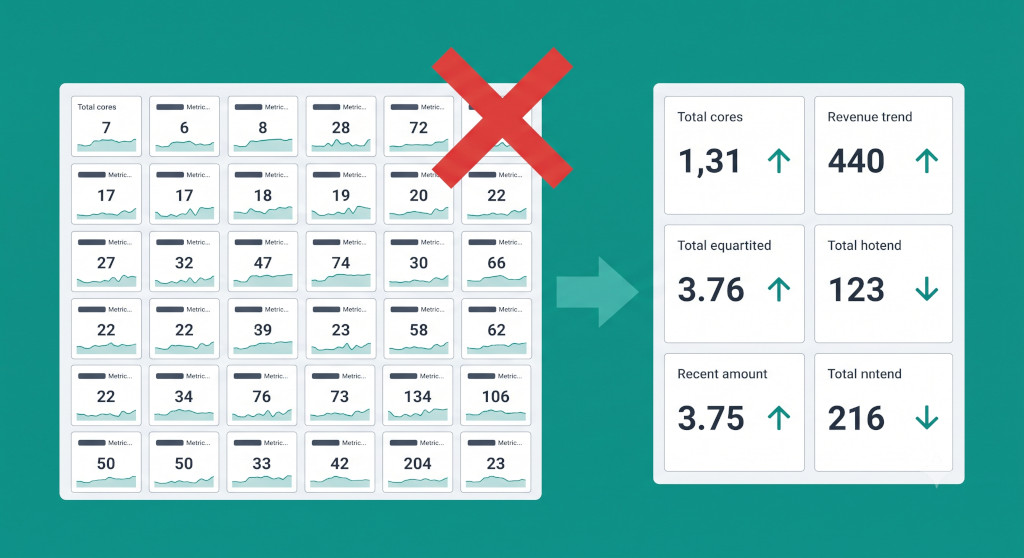
The CFO at a six-entity distribution group asked his finance team to build a group dashboard in January. By February it existed: a shared link, a live Tableau view pulling from six entity exports, thirty-four metrics across revenue, margin, cash, debtors, creditors, headcount, and warehouse utilisation. The finance team was proud of it. They had built exactly what they were asked to build.
By April, the CFO had stopped opening it. When his weekly operations call came around, he still asked Priya — the group controller — to send him a summary email. Not because the dashboard was wrong, but because it gave him no clear signal. Everything was on it, but nothing stood out. Reading it felt like scanning a spreadsheet rather than monitoring a business. The dashboard answered every question except the one that mattered most: where do I need to pay attention today?
This is the most common failure mode for group dashboards in multi-entity businesses. Not that they are inaccurate — though that is a separate and serious problem, covered elsewhere — but that they are built for completeness rather than action. They satisfy the brief of “we have a group dashboard” without satisfying the actual need, which is “I can monitor the group in three minutes and know where to look.”
Stop building consolidations in spreadsheets.
BrizoConsol automates multi-entity consolidation — setup in minutes, reports the same day.
The Completeness Trap
Finance teams are trained to be comprehensive. In a set of statutory accounts, completeness is a virtue — leaving something out is a material error. The same instinct applied to dashboard design produces a different outcome: a view so full that the signal is lost in the noise.
The completeness trap operates in a predictable pattern. Someone senior asks for a group dashboard. The finance team lists every metric they currently produce: revenue, gross margin, EBITDA, net profit, cash, debtors, creditors, inventory, headcount, conversion rate, average order value, entity-by-entity splits of all of the above. Each metric is defensible. All of them matter. Together they produce a view that no one can act on quickly, so no one looks at it regularly, so it ceases to serve any monitoring purpose at all.
The irony is that a dashboard with fewer metrics, chosen carefully, drives more decisions than one with thirty-four. The discipline of selection — deciding what not to show — is the hardest part of dashboard design and the part that finance teams most consistently skip.
A dashboard is not a reporting system. It is a monitoring system. Its job is not to answer every question — it is to tell you which questions need asking today.
The Three Questions Every Group Dashboard Must Answer
Before deciding which metrics to include, it helps to anchor the dashboard to the decisions it needs to support. For a CFO or group finance director at an SME multi-entity group, three questions recur more than any others:
Is the group on track? This is a revenue and margin question. It requires a comparison between actual consolidated performance and the plan or prior period — not just a snapshot of where we are, but whether we are moving in the right direction at the right speed.
Is cash safe? This is both a current position question and a short-horizon forecast question. The CFO needs to know the net consolidated cash position today and whether there are any entities where cash is deteriorating faster than the group can absorb.
Which entity needs attention? At group level, the CFO cannot monitor six entities in detail on a daily basis. The dashboard needs to surface whichever entity is deviating from expectation — underperforming on revenue, slow on collections, or running cash down — so that attention is directed to the right place.
Every metric on the dashboard should connect to at least one of these three questions. If a metric does not help answer “on track?”, “cash safe?”, or “which entity needs attention?”, it belongs in a management report or a drill-down view — not on the primary dashboard.
One Dashboard Cannot Serve Three Audiences
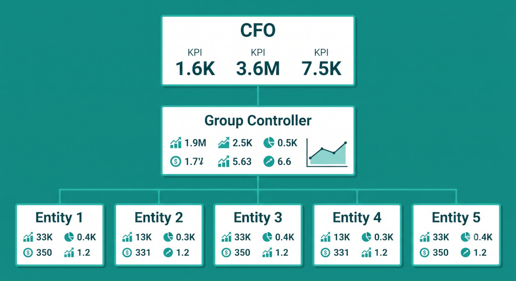
A second reason group dashboards fail to get used is that they try to serve multiple audiences at the same level of detail. The CFO, the group controller, and an individual entity manager each need different things from a group monitoring tool. Designing a single view that works for all three typically means it works well for none of them.
The CFO needs the group view: three to six metrics at consolidated level, instantly readable, with a clear signal on which entity — if any — needs a conversation. The right answer to every question on this view should be either “yes, fine” or “look at this.” Anything that requires interpretation before it communicates a signal belongs on a different level of the dashboard.
The group controller needs a broader operational view: the same consolidated metrics as the CFO, but with entity-level breakdowns visible alongside them. The controller needs to see not just that group debtors have risen 12% month-on-month, but which entity is driving it. They need to know whether the cash position at Entity 4 is a short-term timing issue or a structural problem. The controller’s view has more metrics than the CFO’s, but they are metrics the controller will act on — not metrics included for completeness.
The entity manager needs a view focused on their own entity’s performance against group benchmarks. How does their margin compare to sister entities? Are their debtor days in line with the group standard? Are there intercompany balances that need clearing before month-end? This level of the dashboard is entirely different in character from the CFO view — operational rather than strategic, entity-specific rather than consolidated.
Building these as three separate views of the same underlying consolidated data — rather than one view that tries to serve all three — is the design choice that makes each view actually usable. BrizoConsol’s Virtual Groups capability supports exactly this: a CFO can see the full group view, while a divisional director sees the consolidated picture for their cluster of entities, and an entity manager sees their own entity alongside the group benchmark — all from the same data source, without maintaining separate reporting models.
What to Cut: Metrics That Look Important but Rarely Drive Decisions
The most common candidates for removal from an overloaded group dashboard are metrics that describe the business rather than signal a problem. Headcount is a good example. It matters — but it changes slowly, rarely triggers an immediate decision, and adds visual weight to a dashboard that then has less room for the metrics that do drive action. It belongs in a monthly management report, not on the primary dashboard.
The same applies to trailing metrics that are already captured elsewhere. If the group has a monthly board pack that shows a twelve-month revenue trend, the group dashboard does not also need to show the twelve-month revenue trend. The dashboard should show the current month versus plan and a health signal — not duplicate content from the reporting pack.
Common mistake: Adding a metric to the dashboard because it is available, not because anyone has identified the decision it supports. Every metric added to a dashboard increases the cognitive load of reading it. The question to ask of each metric is not “is this useful?” but “will someone act differently today because they saw this on the dashboard?”
The table below shows the metrics that consistently appear on effective group dashboards versus those that consistently clutter ineffective ones. This is not a universal rule — a cash-intensive business will weight cash metrics more heavily, a people business will weight headcount — but it reflects the pattern across most SME multi-entity groups.
| Keep on the CFO dashboard | Move to the management report or drill-down |
|---|---|
| Consolidated revenue vs plan (current month) | Twelve-month revenue trend |
| Consolidated gross margin vs plan | Gross margin by product line or service category |
| Net group cash position | Cash flow bridge (sources and uses) |
| Trade debtor days (external, consolidated) | Aged debtor analysis by entity |
| Entity health scores (traffic-light) | Full entity P&L for each subsidiary |
| One forward-looking signal (e.g. pipeline coverage or order book) | Headcount, utilisation, conversion rate |
For a thorough treatment of which metrics to track at group level — including operational KPIs beyond the financial statements — see our guide to group KPI reporting for multi-entity businesses.
See what a focused group dashboard looks like in practice
BrizoConsol’s default dashboards are built around the metrics that drive decisions — consolidated, eliminations applied, with entity health scores that surface signals automatically.See It In Action
From Monitoring to Signal: How Health Scores Change the Dynamic

The most common response to an overcrowded dashboard is to reduce the number of metrics. That is necessary but not sufficient. The deeper problem with most group dashboards is that they require the reader to form their own judgement from a set of numbers. The CFO reads consolidated revenue, reads the plan, calculates the variance, assesses whether it is material, determines whether any entity is likely responsible, and then decides whether to follow up. That is five cognitive steps before any action is taken.
A well-designed dashboard eliminates most of those steps. Instead of presenting a number and requiring the reader to evaluate it, it presents a signal — a health score, a traffic light, a trend arrow — that has already done the evaluation. The reader’s job becomes: “Which signals are amber or red?” rather than “What does this number mean?”
BrizoConsol’s Pulse Health Scores work on this principle. Each entity in the group is scored across key financial dimensions — revenue momentum, cash trajectory, margin pressure, debtor age — and the scores are visible at group level as a row of signals rather than a table of numbers. A CFO scanning the group dashboard sees immediately that Entities 1, 2, 4, and 5 are green and Entity 3 is amber. They do not need to calculate which entity is underperforming — the dashboard has already done it. The CFO’s next step is to ask the group controller about Entity 3, not to find it by reading through six rows of data.
This changes the relationship between the CFO and the dashboard. A dashboard that requires interpretation gets opened occasionally, when there is time to think through the numbers. A dashboard that surfaces signals gets opened every morning, because the marginal cost of checking it is thirty seconds and the information it provides is immediate. That is the difference between a monitoring tool and a reporting archive.
The Forward-Looking Problem
Most group dashboards are entirely backward-looking. They show last month’s revenue, last week’s cash position, the debtor balance as of yesterday’s close. This is appropriate for some questions — cash and debtors need current data — but it means the dashboard gives no signal about where the group is heading.
Adding one or two forward-looking metrics transforms the monitoring value of the dashboard significantly. The exact metric depends on the business: a services business might track pipeline coverage or billable utilisation; a product business might track order book or inventory cover; a subscription business might track churn rate or net revenue retention. The principle is the same — one metric that tells the CFO something about next month, not just this one.
Forward-looking metrics are harder to automate than financial statement metrics, because they often live outside the accounting system. But they are often the metrics the CFO pays most attention to, which means leaving them off the dashboard is a significant reason dashboards fail to become the primary monitoring tool.
Building a Group Dashboard That Gets Used: A Checklist
If you are starting from scratch — or rebuilding a dashboard that has stopped being used — the following steps apply in order. Skipping to metric selection before the first two steps are done reliably produces the same result as before.
- Make the underlying data correct before designing the view. A dashboard built on aggregated entity data — without intercompany eliminations and proper currency translation — will be distrusted the moment someone spots a number that does not reconcile to the consolidated accounts. The underlying data must come from the consolidation output, not the entity accounting tools. Our guide to how finance teams should structure and use dashboards covers this foundation in more detail.
- Define the audience for each layer. Name the specific person or role who will use each level of the dashboard. “The CFO” is a person with specific decision-making needs, not an abstract audience. Design the CFO view by asking what decisions they make in a typical week and what information those decisions require.
- Select metrics by decision, not by availability. For each metric you are considering, name the decision it supports and the action the reader would take if the metric were green versus amber versus red. If you cannot name both, remove the metric.
- Set the threshold for each signal. A traffic light system is only useful if the thresholds are calibrated to the business. Amber on debtor days might mean >45 days for one group and >60 days for another. Set these thresholds explicitly rather than leaving the reader to judge.
- Build the CFO view to be readable in under three minutes. Time yourself. If reading the full CFO dashboard and forming a clear view of group health takes longer than three minutes, there are too many metrics or too much information density. Cut until it does not.
- Add one forward-looking metric. Choose the single leading indicator most predictive of next month’s performance in your business. Add it to the CFO view alongside the financial statement metrics.
- Review it weekly for the first three months. Not to check the numbers — to check whether the dashboard is driving conversations. If the CFO is still asking for the summary email rather than opening the dashboard, something is wrong with the design, not with the CFO. Fix the design.
For context on what the consolidated reporting layer that feeds a group dashboard should contain, our guide to what a group monthly management report should include covers the full picture. The board-level reporting layer — which draws on the same consolidated data but serves a different audience with different cadence — is covered in our post on board reporting for multi-entity groups.
Priya eventually rebuilt the group dashboard for her CFO — not by adding better data, but by cutting the metric count from thirty-four to seven, adding Pulse Health Scores for each entity, and building a separate controller view with the full operational detail. The CFO now opens it every morning. The summary email no longer exists. The dashboard did not become more useful by becoming more complete — it became useful by becoming more focused.
Start your free trial — built-in group dashboard included
BrizoConsol’s default group dashboards are designed around the metrics that drive decisions, with Pulse Health Scores that surface entity signals automatically. No configuration required to get started. Start Free Trial