Why Your Multi-Entity Group Still Doesn’t Have a Real Dashboard
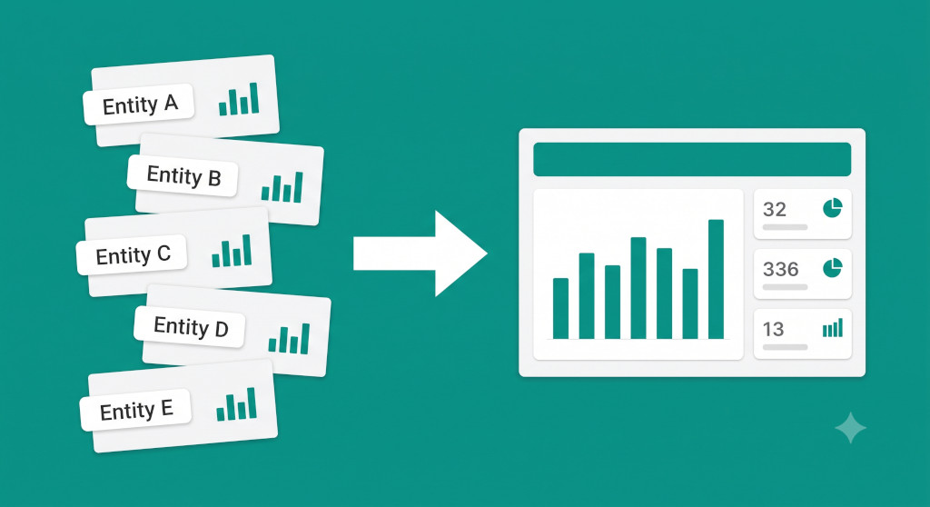
Every Monday morning, Sarah opened five browser tabs. One for each of the Xero accounts her group ran: three UK entities, one in Australia, one in Singapore. She worked through them in sequence — revenue this week, debtor balance, cash position — noting the numbers in a spreadsheet she had built herself. It took the best part of two hours. By the time she emailed the weekly summary to the CFO, the numbers reflected last Thursday’s closes.
When the CFO asked how the group was performing as a whole, Sarah could give him a rough answer, but it came with caveats. The Australian entity’s figures were converted at whatever rate she had looked up that morning. The intercompany recharge from the UK holding company to the Singapore subsidiary was counted in both entities’ revenue lines. The Singapore entity’s receivables included £120,000 owed by a sister company. None of this was wrong, exactly — but none of it was right, either.
What Sarah had was six data sources. What she did not have was a group dashboard. The distinction matters more than most finance teams realise, and it is the reason that multi-entity groups consistently find themselves flying blind on group performance even when every individual entity is well-managed and well-reported.
Stop building consolidations in spreadsheets.
BrizoConsol automates multi-entity consolidation — setup in minutes, reports the same day.
The Gap Between Entity Dashboards and a Group Dashboard
An entity dashboard answers “how is this company doing?” A group dashboard answers “how is the group doing?” These are different questions, and they require different data. A group dashboard is not a collection of entity dashboards — it is a consolidated view built from data that has already been through the consolidation process: intercompany transactions eliminated, foreign currencies translated to a single reporting currency, and minority interests appropriately separated.
When finance teams skip this and simply aggregate entity-level figures — whether manually, in a spreadsheet, or by pulling reports directly from their accounting software — they create a view that looks like a group dashboard but behaves like an unreliable one. The numbers are wrong in ways that are hard to spot until someone digs into them.
The core problem is structural. Accounting software like Xero, QuickBooks, Zoho Books, and MYOB is designed to run a single entity’s books. It has no concept of a sister company, no mechanism for eliminating intercompany transactions, and no built-in currency translation that feeds a consolidated output. These tools do their job well at the entity level. But at the group level, their dashboards are starting points, not answers. For a thorough grounding in why this matters, our guide to group reporting for multi-entity businesses covers the underlying framework.
Why Adding Up Entity Dashboards Gives You the Wrong Number
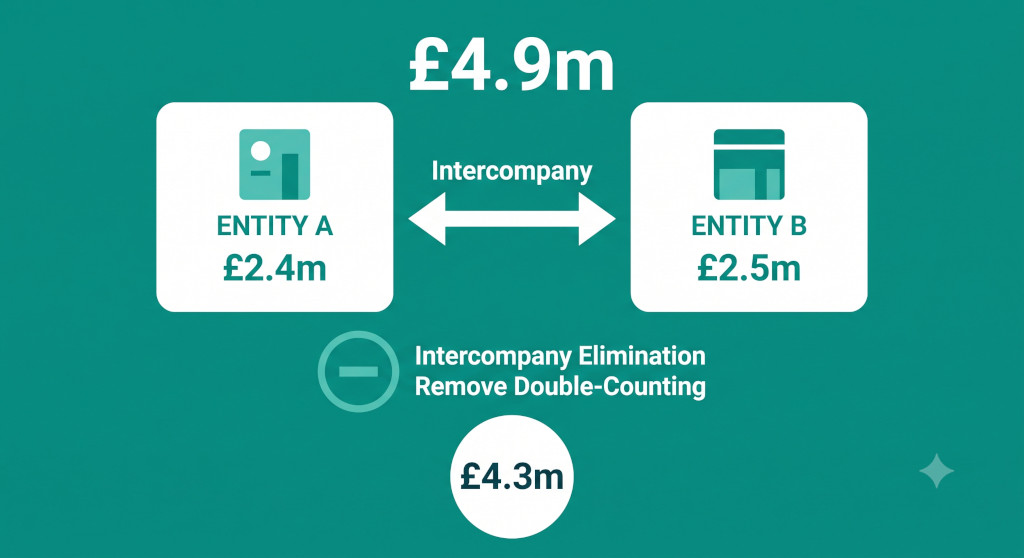
The clearest illustration of this problem is revenue. Consider a three-entity group: Entity A (UK services company), Entity B (UK delivery subsidiary), and Entity C (Australian operating company).
| Entity | Reported Revenue | Of Which: Intercompany | Currency |
|---|---|---|---|
| Entity A (UK) | £2,500,000 | £400,000 to Entity B | GBP |
| Entity B (UK) | £1,800,000 | £180,000 to Entity C | GBP |
| Entity C (Australia) | AUD 1,200,000 | — | AUD (rate: 0.52) |
| Naïve group total | £4,924,000 |
If you simply add these up — converting AUD 1,200,000 at a rate of 0.52 to get £624,000 — you get group revenue of £4,924,000. But this number is wrong by £580,000. The £400,000 from Entity A to Entity B and the £180,000 from Entity B to Entity C are transactions within the group. They inflate the group’s revenue because the same economic activity has been counted twice. After eliminating intercompany revenue, the correct consolidated figure is £4,344,000.
Naïve entity aggregation …………………… £4,924,000
Less: Entity A → Entity B intercompany ………. (£400,000)
Less: Entity B → Entity C intercompany ………. (£180,000)
Correct consolidated revenue ………………… £4,344,000
A CFO reading the entity dashboard view is seeing revenue that is overstated by 13.4%. They may be making staffing decisions, dividend decisions, or covenant compliance assessments based on a number that is simply not what the group earns from third parties. The same problem applies to the balance sheet — intercompany receivables and payables inflate the group’s total assets and liabilities until they are eliminated — and to intercompany profit on inventory that has not yet been sold outside the group.
Common mistake: Many finance teams know about intercompany eliminations at month-end but believe their “quick look” at entity dashboards during the month is good enough for monitoring purposes. The problem is that management decisions get made on the basis of those monitoring numbers, and a 13% overstatement of revenue is not a rounding error.
For a detailed treatment of what intercompany eliminations cover and how they work, see our complete guide to intercompany eliminations.
The Currency Problem That Makes It Worse
In a single-currency group, the intercompany double-count is the main source of error in an aggregated dashboard. In a multi-currency group, you have a second layer of distortion: foreign currency conversion.
When a finance team manually converts AUD figures to GBP for the weekly summary email, they are typically using a spot rate looked up that morning or the rate from last month’s close. If the AUD has moved since then, the comparison to prior periods is not clean. If different people in the team use different rates on different days, the weekly figures are inconsistent with each other even when the underlying entity performance has not changed.
A proper group dashboard uses the translation rates that have been applied in the consolidation — average rate for P&L, closing rate for balance sheet, historic rate for equity — so that the numbers on screen are consistent with the audited group accounts. This sounds like an implementation detail. In practice it is the difference between a monitoring tool that finance trusts and one that it perpetually second-guesses.
What a Live Group Dashboard Actually Looks Like
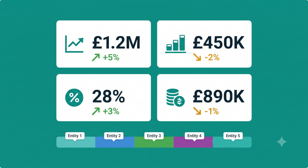
Once the consolidation is properly automated — entities connected, intercompany pairs configured, currencies translated — a group dashboard can show things that entity dashboards structurally cannot.
BrizoConsol’s Pulse Health Scores are a practical example of what this looks like in practice. Rather than requiring the CFO to read a table of numbers and form their own judgement, health scores give a colour-coded signal for each entity and for the group as a whole across key financial dimensions. When an entity’s cash position deteriorates, or its receivables age profile extends beyond the group norm, the score moves before the month-end report arrives. A finance director monitoring the group does not need to read five entity dashboards in sequence — the group view surfaces the signal.
The specific metrics that belong in a group dashboard will vary by industry and by the CFO’s priorities, but the core set for most SME groups looks like this:
| Metric | Why it belongs in the group dashboard | Why entity dashboards get it wrong |
|---|---|---|
| Consolidated revenue | Shows what the group earns from third parties | Includes intercompany revenue — overstated |
| Consolidated gross margin | True profitability after eliminating internal markups | Intercompany markups inflate margin in selling entity, depress it in buying entity |
| Group net cash position | Total external cash available to the group | Intercompany cash transfers are double-counted; intercompany loans inflate both cash and borrowings |
| Trade debtors (external only) | Real credit exposure to third-party customers | Intercompany receivables inflate the debtor balance and distort the debtor days calculation |
| Entity health scores | Quickly identifies which entities need attention this week | Requires reading five separate reports in sequence |
Our guide to group KPI reporting for multi-entity businesses covers the full range of metrics worth tracking at group level, including operational KPIs beyond the financial statements.
See a live group dashboard built from your actual entities
Connect your Xero, QuickBooks, Zoho Books, MYOB or Excel entities and see consolidated group metrics — eliminations applied, currencies translated — without a Monday morning aggregation ritual.See It In Action
The Month-End Close Connection
A group dashboard is only as current as the underlying consolidation. This is where many groups discover a second problem: the consolidation itself is slow. If the consolidated figures are only available five working days after month-end, the dashboard reflects last month’s close for the first third of the current month. Monitoring a dashboard built on stale data is only marginally more useful than not having one.
The solution is not to monitor entity-level numbers during the month and switch to consolidated numbers at close. The solution is to run the consolidation more frequently — and to make each close faster so that the lag between entity data and group view shrinks.
BrizoConsol’s month-end status view shows which entities have submitted their data, which are still in review, and which have been signed off. A group finance manager can see at a glance whether all five entities are ready to run, or whether one subsidiary’s delayed close is holding up the group dashboard. The consolidated view updates as each entity submits, so the group picture builds through the close process rather than appearing in a single batch at the end. For the tactics that make each individual close faster, see our guide to how finance teams should structure and use their dashboards.
When the CFO Wants a Different Cut
A consolidated group dashboard shows the group as a legal structure. But many CFOs also need to see the group cut differently — by division, by geography, by product line — without those cuts corresponding neatly to legal entity boundaries. A UK holding company might own three entities that all sit within the “consulting” division and two that sit within the “technology” division. The CFO wants divisional dashboards, not entity dashboards.
This is the problem that Virtual Groups in BrizoConsol are built for. A Virtual Group allows a finance team to define a reporting structure that cuts across the legal entity structure — grouping entities by division, region, or ownership without touching the underlying legal consolidation. The CFO can toggle between the legal group view and the divisional view in the same dashboard, using the same underlying consolidated data. There is no separate spreadsheet to maintain and no risk that the divisional numbers add up to a different total from the legal group numbers.
Drilling Down When the Number Looks Wrong
The other thing a proper group dashboard needs to support is investigation. When the CFO sees that consolidated revenue is down 8% against budget in a specific month, the dashboard should not be a dead end. It should be the starting point for a drill-down that gets to the source of the variance without a manual data extraction exercise.
BrizoConsol’s drill-down capability allows a finance director to go from consolidated balance to entity contribution to individual transaction in a single click sequence. The answer to “why is UK revenue down?” does not require a phone call to the UK finance manager or a manual pull from Xero — it is visible in the group tool directly. This changes the relationship between the dashboard and the conversation: instead of the dashboard raising questions that require offline investigation, it raises questions and immediately provides the data needed to answer them.
A group dashboard that cannot be drilled into is just a summary report. The value comes when it connects the group view to the entity detail — and from there, to the transaction that explains the movement.
Building Your Way to a Group Dashboard: A Practical Checklist
If your group is currently monitoring performance through entity-level dashboards or a manually aggregated spreadsheet, the steps below set out the path to a consolidated group view that is reliable enough to make decisions from.
- Map your intercompany flows. List every transaction that flows between entities in the group — management charges, intercompany loans, intercompany sales, shared service recharges. These are the transactions your group dashboard must eliminate before showing revenue, cost, asset, or liability figures.
- Define your group reporting currency. Every entity’s figures will need to be translated into a single currency for the group view. Decide whether you will use a fixed rate or a monthly average/closing rate, and make sure the group dashboard always uses the same rate as the consolidation.
- Identify the five or six metrics your CFO actually acts on. A group dashboard that shows fifty metrics is harder to monitor than one that shows six well-chosen ones. Start with consolidated revenue, gross margin, net cash, trade debtors, and an entity health score. Add depth once the core view is trusted. See our post on what a group monthly management report should include for a useful frame.
- Connect the dashboard to the consolidation output, not the entity source. This is the critical step. If your dashboard pulls directly from entity accounting tools, it will always show pre-elimination numbers. It needs to pull from the consolidated output — the figures that have already been through intercompany elimination and currency translation.
- Run the consolidation more frequently. A group dashboard updated once a month is a reporting tool. A group dashboard updated weekly or more often is a monitoring tool. The difference depends on how quickly and easily the consolidation can be run — which in turn depends on how well-automated the process is.
- Set up entity health monitoring alongside the group total. The group total tells you the result. The entity health scores tell you where to look. Both belong in the same dashboard view.
If the consolidation process itself is the bottleneck — if getting to a trusted consolidated number takes days rather than hours — the dashboard problem will not be solved by improving the dashboard. The constraint is upstream. Financial consolidation software solves the upstream problem, which is why groups that move from Excel consolidation to a dedicated tool typically find that their reporting and monitoring improve as a side effect, not just the close process itself.
Sarah eventually got there. After replacing the manual Monday morning aggregation with a consolidated group dashboard, the CFO’s weekly question — “how’s the group looking?” — became answerable in thirty seconds rather than two hours. The numbers he was reading reflected actual group performance, not six entity views aggregated without eliminations and converted at inconsistent rates. The conversation shifted from “what do the numbers say?” to “what do we do about it?” — which is where a CFO’s time belongs.
Start your free trial — group dashboard included
Connect your entities, run your first consolidation, and see your group’s consolidated performance in a single view. No Monday morning aggregation required. Start Free Trial